
Share:

AI marketing & automation


Marketing teams do not have a data problem anymore. They have a decision problem. Almost 20 percent of marketers say adopting a data-driven strategy is one of their biggest challenges in 2026, according to HubSpot’s State of Marketing Report. Separate research from Funnel found that 86 percent of in-house marketers cannot say which channels are actually driving performance. The dashboards exist. The decisions still are not getting made.
This guide shows you how to build a marketing dashboard around the decisions your team needs to make, not the metrics that happen to be easiest to pull. You will get a framework for choosing KPIs, designing by audience, fixing the data underneath the charts, and setting a review cadence that keeps the dashboard honest six months from now.
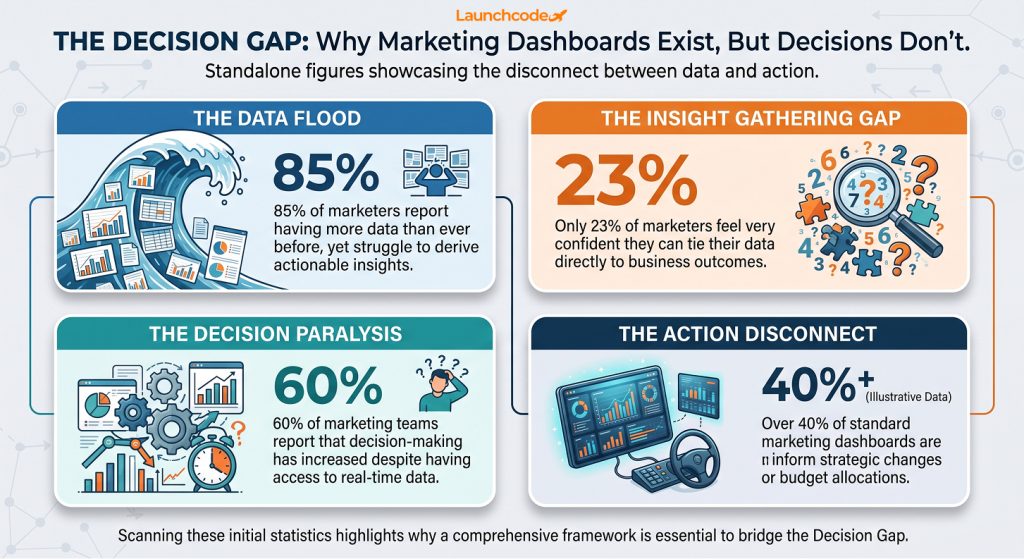
A dashboard that does not change a single decision within 30 days is a display, not a dashboard. Gartner research found that marketing analytics influence only 53 percent of marketing decisions, and a third of decision makers admit they cherry-pick data to fit an opinion they already held. The gap is rarely the chart library. It is the process wrapped around it.
Stephen Few, author of Information Dashboard Design, defines a dashboard as a visual display of the most important information needed to reach an objective, consolidated on a single screen so it can be monitored at a glance, in his widely cited paper on why most dashboards fail. Notice what that definition leaves out. It says nothing about which BI tool you use.
Gartner’s Joseph Enever, Senior Director Analyst on the Gartner Marketing practice, put it directly: CMOs must address cognitive biases and the need for a data-informed culture, rather than assuming better data integration alone will increase how much marketing analytics gets used. That single line explains why teams with excellent tools still make gut-based calls. Roughly a quarter of decision makers in the same Gartner survey do not even review the analytics team’s input, and another quarter reject the recommendations outright.
Name the specific decision the dashboard needs to support before you open a BI tool. Write it as a question a stakeholder actually asks, such as “should we shift budget out of paid social this month,” not a vague goal like “track marketing performance.” Every KPI, chart, and filter should trace back to that question.
This is the single biggest structural difference between a dashboard people open every day and one that gets abandoned after a month. Work backward from the decision using this sequence.
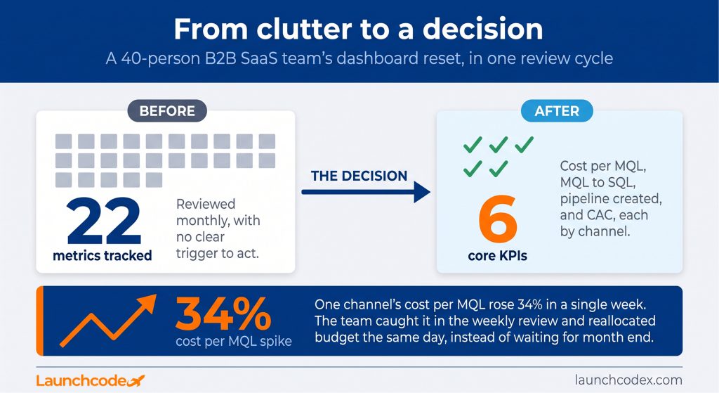
A 40-person B2B SaaS marketing team was splitting budget evenly across paid search, paid social, and organic content, reviewing performance monthly with no clear trigger for change. Once the team named the actual decision (weekly budget reallocation across three channels), the dashboard shrank from 22 tracked metrics to six: cost per MQL, MQL to SQL rate, pipeline created, and CAC, each broken out by channel. Within two review cycles, the team caught a channel where cost per MQL had crept up 34 percent and reallocated budget the same week instead of waiting for the following month.
“When a client asks us to fix their dashboard, the fix is almost never a new chart. It’s admitting nobody agreed on what decision the dashboard was supposed to drive in the first place.” Tanner Medina, Co-Founder and Chief Growth Officer
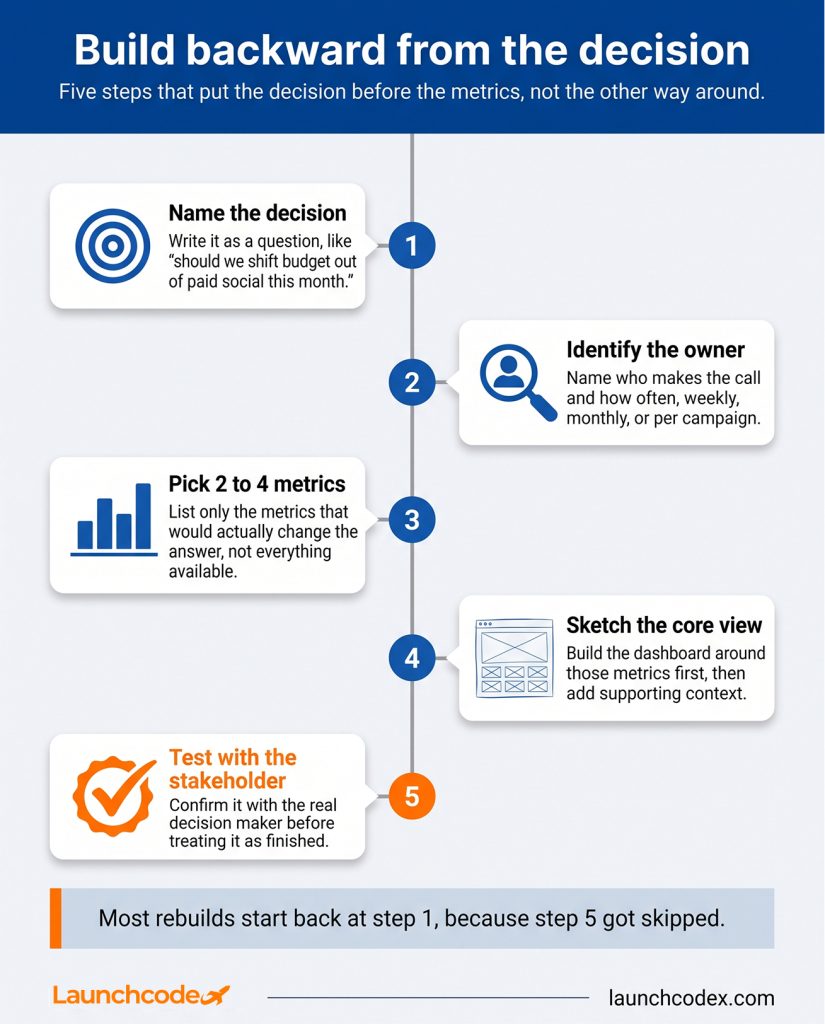
A KPI only belongs on the dashboard if a stakeholder can say what they would do differently when the number moves. Every other metric is context, not a KPI, and belongs one click away in a drill-down view instead of competing for attention on the main screen.
HubSpot’s 2026 State of Marketing data shows the metrics marketers actually prioritize this year: lead quality and MQLs (39 percent), lead-to-customer conversion rate (34 percent), ROI (31 percent), customer acquisition cost (30 percent), and lead generation volume (29 percent). That list is a reasonable starting shortlist, but it still needs to be filtered through the decision you named in the previous section.
Leading indicators, such as click-through rate or new MQLs, tell you what is about to happen. Lagging indicators, such as closed revenue or CAC payback, confirm what already happened. A dashboard built only on lagging indicators tells a true story too late to act on it. Pair at least one leading indicator with each lagging KPI so the dashboard flags a problem before it shows up in the revenue line.
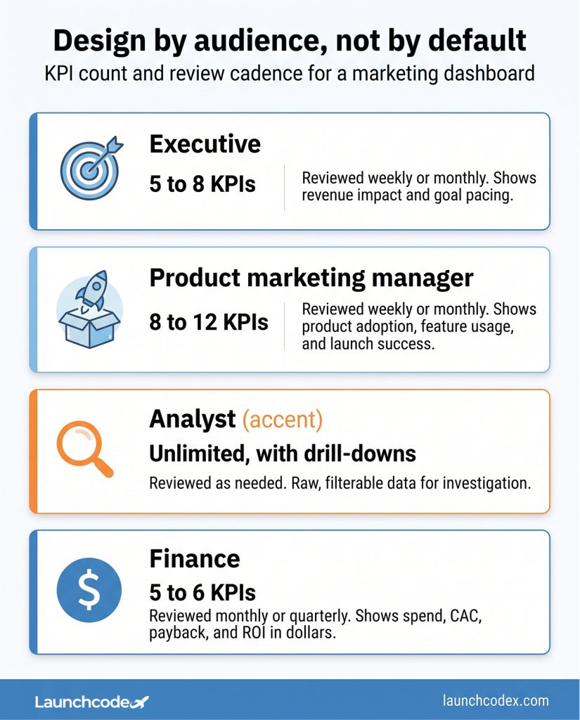
| Audience | KPI count | Review cadence | What it needs to show |
|---|---|---|---|
| Executive | 5 to 8 | Weekly or monthly | Revenue impact and goal pacing |
| Channel manager | 10 to 15 | Daily or weekly | Channel-level efficiency and levers to pull |
| Analyst | Unlimited, with drill-downs | As needed | Raw, filterable data for investigation |
| Finance | 5 to 6 | Monthly or quarterly | Spend, CAC, payback, and ROI in dollar terms |
One dashboard trying to serve executives, channel managers, and analysts at once will satisfy none of them. Build separate views by audience, then link them together so a stakeholder can drill from a summary into detail without switching tools.
The table above already sets the KPI count and cadence for each audience. Layout should follow the same logic. People scan screens in an F-pattern, moving across the top first, then down the left side, so the most decision-critical number always belongs top-left.
A dashboard is only as trustworthy as the data feeding it, and cross-platform data rarely agrees without normalization. Google Ads, Meta, and GA4 each define a conversion differently, use different attribution windows, and handle view-through tracking on their own terms, so combining them without reconciliation produces three different conversion counts for the same campaign.
This is where most “why don’t our numbers match” conversations start. Fixing it before you finalize KPIs and layout saves you from rebuilding the dashboard later once someone notices the discrepancy.
Companies with a strong first-party data source see 40 to 60 percent lower customer acquisition costs and convert at meaningfully higher rates than companies relying on third-party data, according to IAB’s State of Data research. That is a strong argument for anchoring the dashboard in your own CRM and revenue data rather than platform-native reporting alone. It also explains why only 32 percent of marketers globally measure media spend holistically across channels, per Nielsen’s 2025 Annual Marketing Report. Channel-native dashboards make that kind of holistic view structurally difficult.
When Launchcodex consolidated internal client, contract, and revenue data into a single agency-wide dashboard, the hardest part was not the chart design. It was agreeing on one definition of a qualified lead and one attribution window before a single visualization got built.
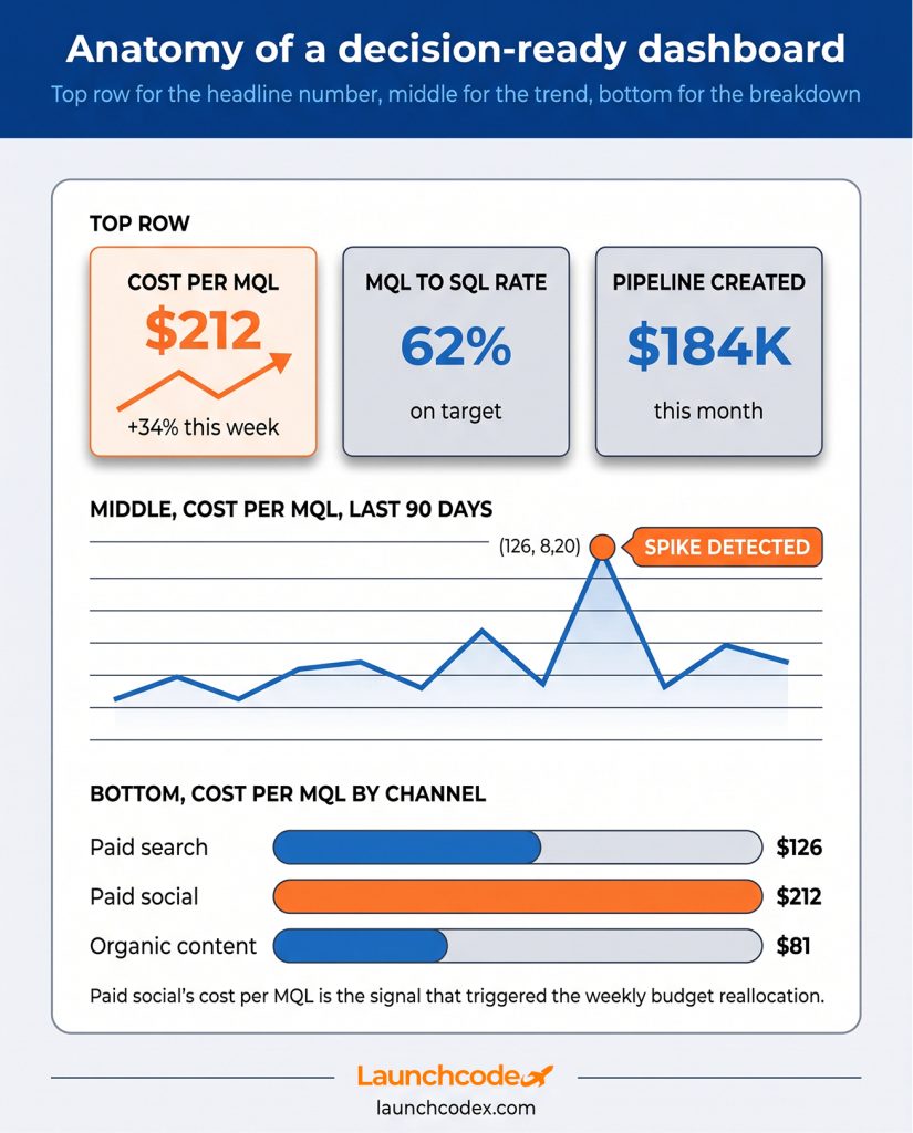
A dashboard nobody checks in real time cannot support a real-time decision. Automated alerts and AI-assisted anomaly detection turn a passive display into an active monitoring system that flags problems the moment they happen, instead of waiting for someone to open a tab.
Set threshold alerts for anything with a hard budget or performance line, such as spend exceeding a daily cap or conversion rate dropping below a set floor. Layer in anomaly detection for unexpected spikes or drops. This often catches a broken tracking pixel or a sudden competitor move before a human would spot the trend in a weekly review.
Henry Arkell, co-founder at Millena, offered a useful caution in Funnel’s research on data-driven decision-making: AI platforms return confident answers, but the underlying data often tells a different story once you examine it, because the model has no knowledge of your pricing change or a competitor’s launch. Kelly Stancil, a data engineer at Mason, makes a related point in the same piece: most models run on historical data, which tells you nothing about the future on its own.
“The AI flags in a dashboard are only as good as the definitions underneath them. We’ve watched anomaly detection throw false alarms for weeks because nobody agreed on what counted as a conversion in the first place.” Derick Do, Co-Founder and Chief Product Officer
The practical takeaway is not to avoid AI-assisted monitoring. It is to treat an AI flag as the start of an investigation, not the final answer.
Marketing and finance rarely speak the same language, and that gap is one of the least discussed reasons dashboards stall at the decision stage. Only 13 percent of marketers say they can explain their results to the finance team, and Funnel’s research cites a figure of just 11 percent of advertisers using KPIs shared between marketing and finance at all.
Build a small translation layer directly into your executive and finance-facing views. Instead of MQLs, show qualified sales opportunities. Instead of ROAS, show marketing ROI in dollar terms. Instead of pipeline velocity, show revenue acceleration rate. The underlying number does not change, only the label and the framing.
“A CFO doesn’t care about MQLs. Translate the number into pipeline or it never survives a budget conversation.” Tanner Medina, Co-Founder and Chief Growth Officer
Tim Radwanski, EVP of strategy at Convertiv, captured why this matters in the same Funnel research: data is often described as the new oil, but it behaves more like clay, only useful once it has been shaped and managed correctly. A finance-facing dashboard is one of the clearest places that shaping pays off, because it is what stands between a marketing team and its next budget approval.
Before you build or rebuild a dashboard, run it through one question. What decision does this answer, who reviews it, how often, and what happens if the honest answer is nothing? If a dashboard fails that test, it is a report pretending to be a dashboard, and it belongs on a monthly email instead of a live screen someone is supposed to check daily.
Set a review cadence from day one rather than waiting for the dashboard to go stale. Audit KPIs quarterly against current business priorities, and retire any chart that has not informed a single decision in the last 60 days. Culture matters here as much as process. Funnel’s research found that 47 percent of in-house marketers struggle to keep up with the data-driven parts of their job, and 64 percent have not tried a new campaign tactic in more than three months. A technically perfect dashboard can still sit unused inside a team that is not set up to act on it.
Start narrow. Pick one decision, build one focused view around it, and prove it changes something within a month before you expand to a second audience or a second dashboard.
Five to eight for an executive view, and up to 15 for a channel manager’s operational view. Beyond that, move detail into a linked drill-down instead of the main screen.
Daily for active paid campaigns, weekly for channel-level performance, and monthly or quarterly for strategic and executive views. Audit the KPI list itself every quarter.
A dashboard is a live, interactive view built for ongoing monitoring and quick decisions. A report is a static, periodic document built for analysis and historical record-keeping.
No. Start with one dashboard tied to one recurring decision. Add a second only once the first one has proven it changes what the team does.
No. AI is strong at flagging anomalies and forecasting trends, but it lacks context on pricing changes, competitor moves, or sales cycle nuance. A flag should start an investigation, not end one.


Real stories from the people we’ve partnered with to modernize and grow their marketing.