
Share:

AI marketing & automation


Most marketers focus on getting the open. The harder problem comes next. A reader opens your email, scans for two seconds, and decides whether to click or delete. Design controls that moment. When layout, hierarchy, and the call to action work together, opens turn into clicks. When they fight each other, even a strong offer dies in the inbox.
This guide gives you the rules that move that number, with the specific thresholds and data behind each one. You will learn how to build a layout that renders everywhere, how to design a call to action that earns the click, how to handle dark mode and accessibility, how to avoid the technical traps that hide your content, and how to measure design by the metrics that still tell the truth.
Design is the bridge between an open and a conversion. Email returns roughly 36 to 42 dollars for every dollar spent, which makes it the highest ROI channel most teams own. That return only shows up when the email is easy to read and act on. Layout, contrast, and the call to action either reduce friction toward one action or add it.
Treat an email as a path with one destination. Every element should move the reader toward the click. The strongest emails feel obvious. The reader knows in seconds what the message is and what to do next.
The numbers explain the stakes. According to Stripo’s analysis of Omnisend ROI data, email outperforms paid channels on return. Design is how you capture that return instead of leaking it.
Poor design is a revenue problem, not a cosmetic one. A cluttered email with three competing buttons splits attention and lowers clicks. An image-only email that fails to load shows a blank box. A 10 pixel font on a phone gets deleted. Each flaw adds a reason to do nothing.
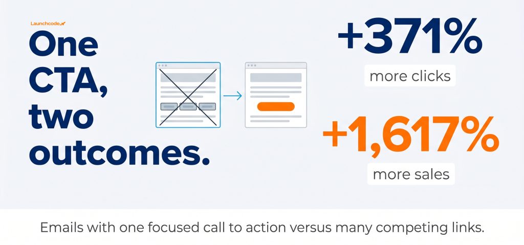
Design for the phone first, then scale up. About 62 percent of email opens happen on mobile, and roughly 70 percent of people delete emails that are not mobile-friendly within seconds. Use a single-column layout at about 600 pixels wide. It stacks cleanly, renders consistently across clients, and keeps the reader moving down toward your call to action.
A single column is the safest structure in email. Multi-column layouts often break on Android apps and older Outlook versions, which can scramble the reading order and push your button below the context. One column removes that risk and supports fast scanning on a small screen.
Structure each email like an inverted pyramid. Lead with a clear header or hero, follow with supporting detail, then narrow to one prominent call to action. This pattern guides the eye toward the click. It also matches how people scan, usually in an F pattern or Z pattern down the page.
The mobile data behind this appears in Searchlab’s 2026 email statistics, which puts the majority of opens on phones. Design accordingly.
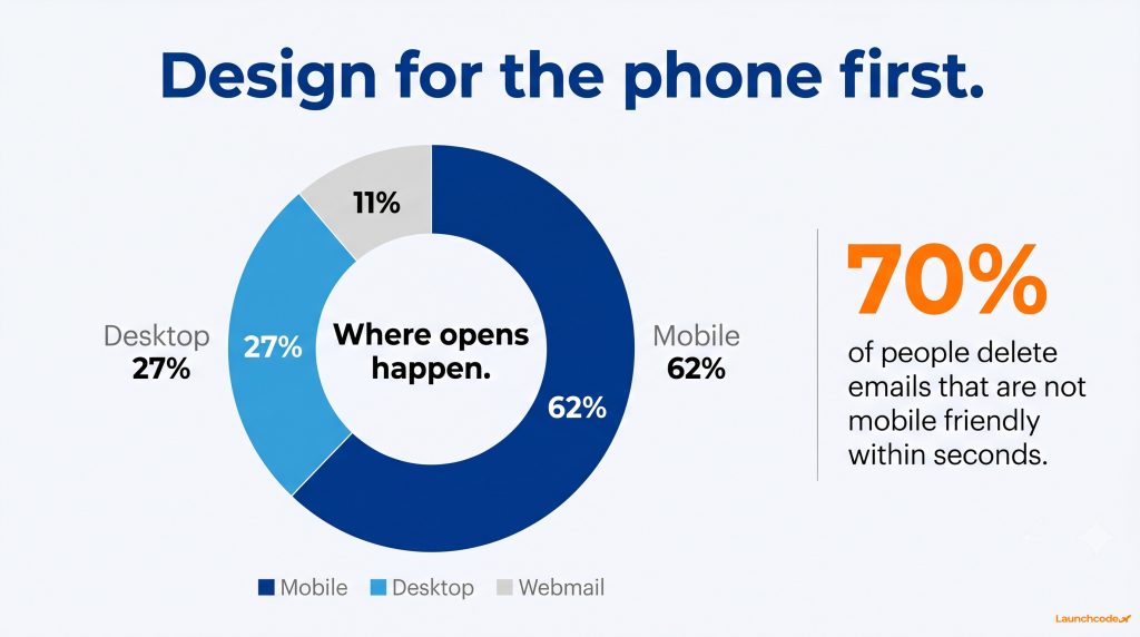
Build every email around a single primary action. Emails with one focused call to action increased clicks by 371 percent and sales by 1,617 percent compared to emails with competing links, in WordStream case data. Multiple buttons create decision fatigue. One clear button, repeated where it makes sense, removes the hesitation that stops people from clicking.
This does not mean an email can hold only one link. It means the design should support one decision. Your primary button should be the most visually dominant element, with high contrast and clear, action-led copy.
Vague labels lose clicks. Specific labels win them. Replace “Click here” or “Learn more” with copy that names the result.
Descriptive copy also helps screen reader users, who often hear links read as a list out of context.
Make the button easy to tap. Benchmark’s design guidance recommends a tap target of at least 44 by 44 pixels and body text of at least 16 pixels. Place the primary button above the fold on mobile so the reader sees it without scrolling, then repeat it once near the end for longer emails.
“On a client send last quarter, we cut three buttons down to one primary CTA and the click rate climbed without changing the offer at all. The button was the bottleneck, not the message.” Brittany Charles, SVP Client Services
Teams that pair this with conversion rate optimization often find the same thing.
Readers scan, they do not read. Strong typography lets them grasp the message and find the button fast. Use a minimum 16 pixel body font, a line height of about 1.5 to 1.6, left-aligned body copy, and a clear size jump between headings and text. Hierarchy built on size and weight survives even when colors shift in dark mode.
Type is how people consume the message. As Dyspatch puts it, the best email typography does not call attention to itself, it just works. Clean hierarchy lowers the effort it takes to understand the email, and lower effort means more clicks.
Custom web fonts often fail to load in email. Protect your design with a fallback stack. Start with your brand font, then fall back to system fonts like Arial, Helvetica, Verdana, or Georgia so the layout holds when the first choice does not appear.
The line spacing and container guidance above follows Dyspatch’s email typography guide, which treats these fundamentals as the line between professional and amateur emails.
Plan for dark mode from the start, not as a fix at the end. Many readers now use dark mode, and email clients handle it three ways: full inversion, partial inversion, and full support for custom dark styles. Use transparent PNG logos, soft grays instead of pure black or white, and high contrast buttons so your brand stays intact when the background flips.
Dark mode breaks emails that assume a white background. A dark logo on a transparent background can vanish. An image with a white box looks wrong against black. The goal is an email that reads well in both modes without shipping two separate designs.
Previews do not always match real inboxes. Open your email on real iOS and Android devices in dark mode, and use a tool like Litmus or Email on Acid to check rendering across clients. View the email in grayscale too. If the hierarchy still reads without color, it will survive dark mode.
Accessible emails reach more people, perform better, and lower legal risk. Meet WCAG AA with a contrast ratio of at least 4.5 to 1 for normal text and 3 to 1 for large text, descriptive alt text on meaningful images, live text instead of text baked into graphics, and a logical heading order. Clear, accessible design removes friction for every reader, not only those who use assistive technology.
Accessibility and conversion point the same direction. A clean layout, readable text, and logical flow help everyone, including people scanning on a bright screen or with images turned off. The friction you remove for assistive technology is friction you remove for the whole list.
The Web Content Accessibility Guidelines, published by the W3C, set the standard most laws point to. The European Accessibility Act took effect on 28 June 2025 and extends digital accessibility duties that touch marketing email, as covered in DeBounce’s accessibility guide. In the United States, regulators and courts increasingly treat marketing email as part of your digital experience under the ADA and Section 508.
Accessibility is also a competitive edge because so few teams do it. About 43 percent of marketers never or only sometimes consider accessibility during production, and WCAG contrast thresholds are spelled out in The A11Y Collective’s email guidance. A quick way to start:
Some emails never get a fair chance because the inbox hides them. Gmail clips emails once the HTML passes about 102 kilobytes, cutting off content and breaking open tracking when the pixel sits at the bottom. Keep your code under 100 kilobytes, place tracking and unsubscribe links near the top, and trim bloated formatting so your full message and button always show.
Clipping is a silent conversion killer. When Gmail clips an email, the reader sees a “Message clipped” notice and a link they rarely click. If your call to action sits past the cut, it disappears. Worse, a tracking pixel at the bottom never loads, so your open data looks artificially low and sends you chasing the wrong problem.
The clipping threshold drops sharply on some mobile clients. Data Axle’s clipping breakdown notes the limit can fall to roughly 20 kilobytes on iOS, far below the desktop ceiling. If a large share of your list opens on a phone, keep emails short and link out to a web page for longer content. Sound web development practices keep templates clean enough to stay under these limits.
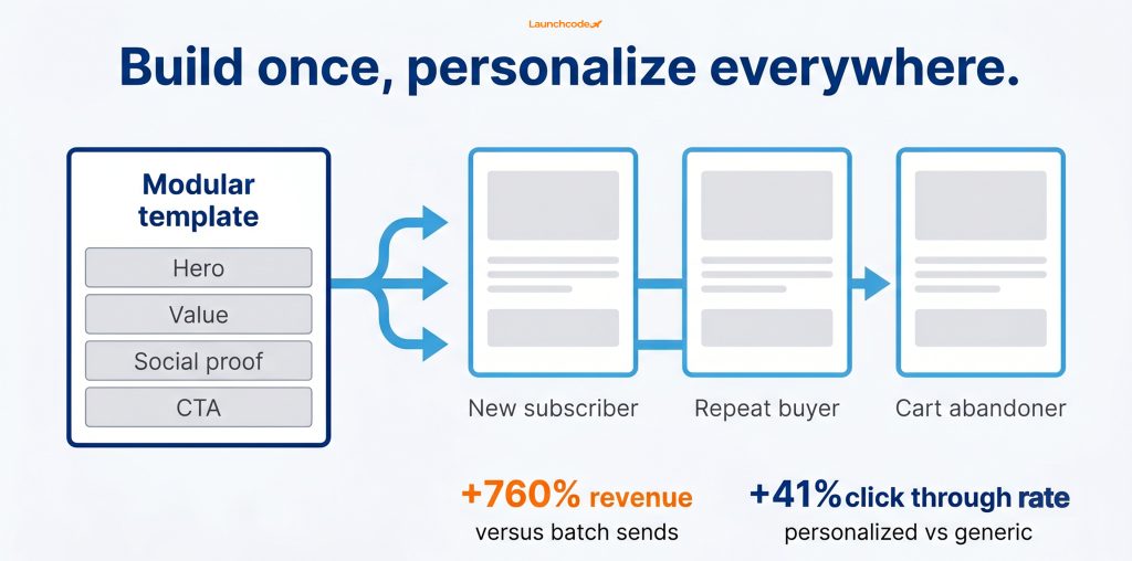
Relevance drives clicks more than aesthetics. Segmented campaigns generate about 760 percent more revenue and roughly 50 percent more clicks than batch sends, and personalized emails earn about 41 percent higher click-through rates. Build modular templates with content blocks you can swap by segment or behavior, so one clean design serves many tailored versions.
Personalization in 2026 goes well past a first name. Dynamic content blocks change based on what a reader bought, viewed, or where they sit in the funnel. A modular template makes that practical because you rearrange blocks instead of rebuilding emails.
“A modular block library lets us ship 20 personalized variants from one template instead of rebuilding each email by hand. That is how segmentation becomes practical at scale.” Derick Do, Co-Founder and Chief Product Officer
This is the kind of system Launchcodex builds for clients, pairing a modular email marketing template library with the segmentation that makes personalization pay off.
AI now adapts copy and content to the individual reader. Research from Litmus and Enflow found AI-driven copy personalization can lift click-through rate by more than 13 percent, and behavior-based personalization using purchase history can lift it by up to 39 percent. As HubSpot’s Amy Mario notes, the brands that win are getting mental bookmarks, not just likes. Design that supports dynamic, relevant content earns that recall.
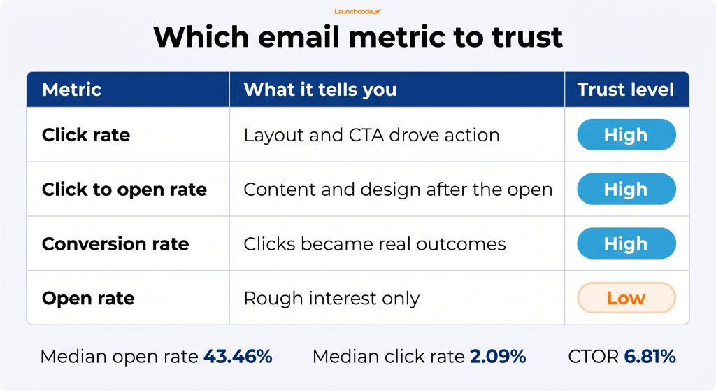
Judge design by clicks, click to open rate, conversions, and revenue per email. Open rate no longer tells the truth because Apple Mail Privacy Protection inflates it. For context, the global median open rate hit 43.46 percent in 2025, while the median click rate sat at 2.09 percent and the click-to-open rate at 6.81 percent. Use those lower funnel metrics to prove a design choice worked.
Treat a design change as a hypothesis. Test it, then read the right number. If you fix a button and clicks rise while opens stay flat, the design worked. If you only watch opens, you learn nothing real.
“We stopped reporting open rate to clients after Apple MPP rolled out and moved to click rate and revenue per email. Those numbers actually track what a design change does.” Derick Do, Co-Founder and Chief Product Officer
| Metric | What it tells you | Why trust it now |
|---|---|---|
| Click rate | Whether the layout and CTA drove action | Direct signal of design performance |
| Click to open rate | How well content and design performed after the open | Less distorted by privacy tools |
| Conversion rate | Whether clicks became real outcomes | Connects design to revenue |
| Open rate | Rough interest only | Inflated by Apple MPP, treat as directional |
The benchmark figures above come from MailerLite’s industry data. As the Stripo email design team puts it, the best design for your audience is the one you have actually tested. Connecting these metrics to pipeline takes clean data infrastructure, so design decisions tie back to revenue.
Run A/B tests from highest to lowest expected impact: subject line first, then hero, then CTA copy, then button color, then layout. Change one element at a time so you know what moved the result.
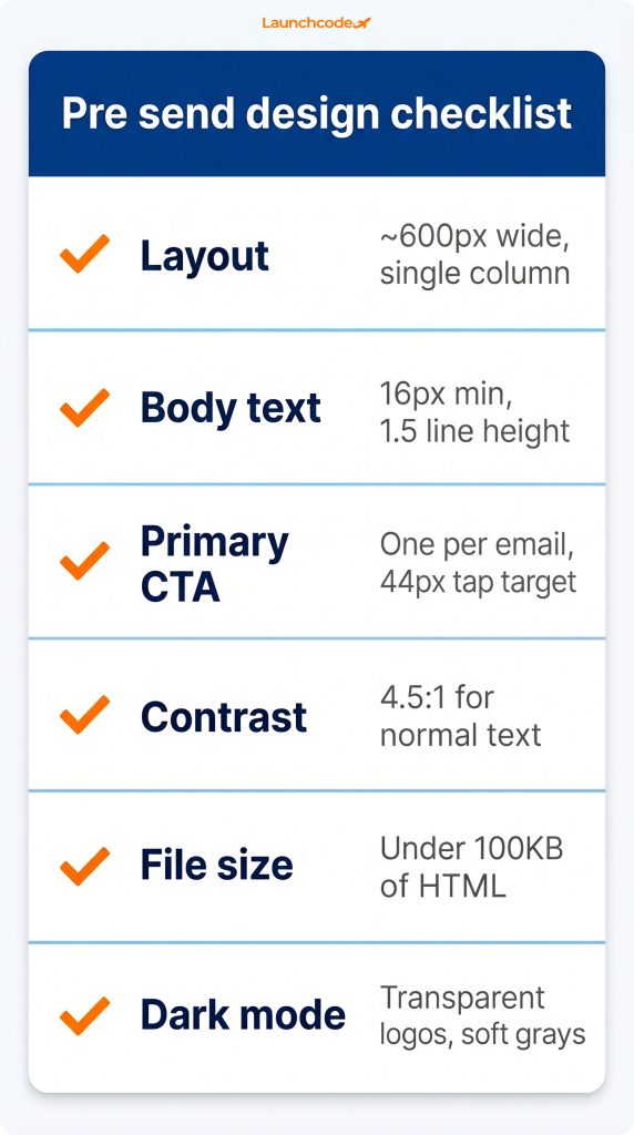
Use these thresholds as a pre-send checklist. Each one maps to a reason it lifts conversions, so you can spot the weak point in any email fast.
| Element | Recommended threshold | Why it lifts conversions |
|---|---|---|
| Layout | Single column, about 600 px wide | Renders cleanly and guides the eye to one action |
| Body text | 16 px minimum, 1.5 line height | Easy to scan on small screens |
| Primary CTA | One per email, 44 px tap target | Removes decision fatigue and is easy to tap |
| Contrast | 4.5 to 1 for normal text | Readable for everyone and meets WCAG AA |
| File size | Under 100 kilobytes of HTML | Avoids Gmail clipping that hides your CTA |
| Dark mode | Transparent logos, soft grays | Keeps brand and readability intact |
The fastest path to higher converting emails is not a single redesign. It is a system. Build a modular, accessible template library that already follows the thresholds above, then test one element at a time and read the lower funnel metrics that still tell the truth. Design becomes a process you repeat, not a guess you make each send.
Start with your next campaign. Open it on a phone in dark mode, count the calls to action, check the contrast, and confirm the HTML stays under 100 kilobytes. Fix what fails, ship it, and watch clicks and conversions rather than opens. That habit, applied every send, compounds into a measurable lift over time.
Design around one primary action. You can include supporting links, but make one button visually dominant. A single focused CTA outperforms emails with several competing links because it removes hesitation.
Use a single column at about 600 pixels wide, up to roughly 640 pixels. This range renders reliably across Gmail, Outlook, and mobile clients, and it keeps the reading flow simple on small screens.
Gmail clips emails when the HTML exceeds about 102 kilobytes. The hidden part, often your CTA, sits behind a “View entire message” link most people ignore. Keep your code under 100 kilobytes and trim unnecessary formatting.
Trust click rate, click to open rate, and conversion rate. Apple Mail Privacy Protection inflates open rate, so it only shows rough interest. Lower funnel metrics show whether your design drove action.
Yes. Many readers use dark mode, and emails that ignore it can show broken logos, weak contrast, or unreadable text. Use tran



Real stories from the people we’ve partnered with to modernize and grow their marketing.