
Share:

AI marketing & automation


Most teams sense that design affects revenue, but they cannot put a number on it. So design loses to features that look easier to justify, and that gap costs real money. A slow page, a bloated checkout, or a 12-field form quietly drains revenue that better design would recover.
This article shows how UX and conversion design create measurable revenue, not just cleaner screens. You get primary source data, a way to rank fixes by expected return, and a simple model that turns a conversion lift into dollars. The goal is a method you can take to finance and leadership, backed by evidence.
Design drives revenue by reducing the effort between a visitor’s intent and a completed action. When users find what they need fast, finish forms without confusion, and trust the interface, more of them convert. The financial effect is large and measurable. Top quartile design companies in McKinsey’s research grew revenue 32 percentage points faster than peers over five years.
The link between design and money is not a soft claim. It shows up in long-term financial performance and in single experiments alike. Treat design as an investment with a return you can estimate, not a matter of taste.
The most cited study on this question comes from McKinsey. In its business value of design research, top quartile design performers posted 32 percentage points higher revenue growth and 56 percentage points higher shareholder returns than industry peers over five years. The pattern held across medical technology, consumer goods, and retail banking.
Benedict Sheppard, a partner at McKinsey Design, called the gap between top design performers and their peers an extraordinary number for such a short period. A separate long-range view from the Design Management Institute found that design-driven companies beat the S&P Index by 228% over 10 years.
Conversion rate is the default metric, but it hides revenue. A design change can lift average order value or attract higher intent buyers without moving conversion rate much. Revenue per visitor captures both. It divides total revenue by total visitors, so it reflects conversion, order value, and traffic quality at once.
“We stopped reporting conversion rate as the headline number and switched to revenue per visitor. On one client flow, conversion rate barely moved but revenue per visitor rose 19% because the redesign pulled in higher intent buyers.” Tanner Medina, Co-Founder and Chief Growth Officer
Use revenue per visitor as your north star. Conversion rate stays useful as a diagnostic, but revenue per visitor is the number that ties design work to the business.
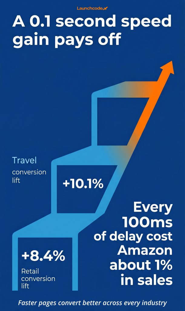
Page speed is the most linear link between design and revenue. Faster pages convert better, and the relationship holds across industries. A 0.1 second improvement in load time was linked to an 8.4% conversion lift in retail and a 10.1% lift in travel, according to the Deloitte and Google study Milliseconds Make Millions.
Speed sits upstream of every other conversion factor. If the page does not load, the offer, the copy, and the product photography never get seen. That makes speed the first place to look when revenue leaks.
The numbers are consistent and easy to translate into dollars. The Deloitte and Google research remains the most rigorous work on speed and business results. Older performance research found that every 100 milliseconds of added latency cost Amazon about 1% in sales, a benchmark that still gets cited because it keeps proving true.
Mobile is where the gap is widest. Google research found that 53% of mobile users abandon a page that takes longer than three seconds to load. More than half your mobile visitors can leave before the page renders.
Google measures real user experience through Core Web Vitals, made up of three metrics:
These thresholds are not only SEO targets. They reflect how fast and stable a page feels. Rakuten 24 improved all three Core Web Vitals and saw a 53% increase in revenue per visitor and a 33% higher conversion rate, per a Google web.dev case study. After years of mobile-first efforts, fewer than half of mobile sites still pass all three Core Web Vitals, so the opportunity is wide open.
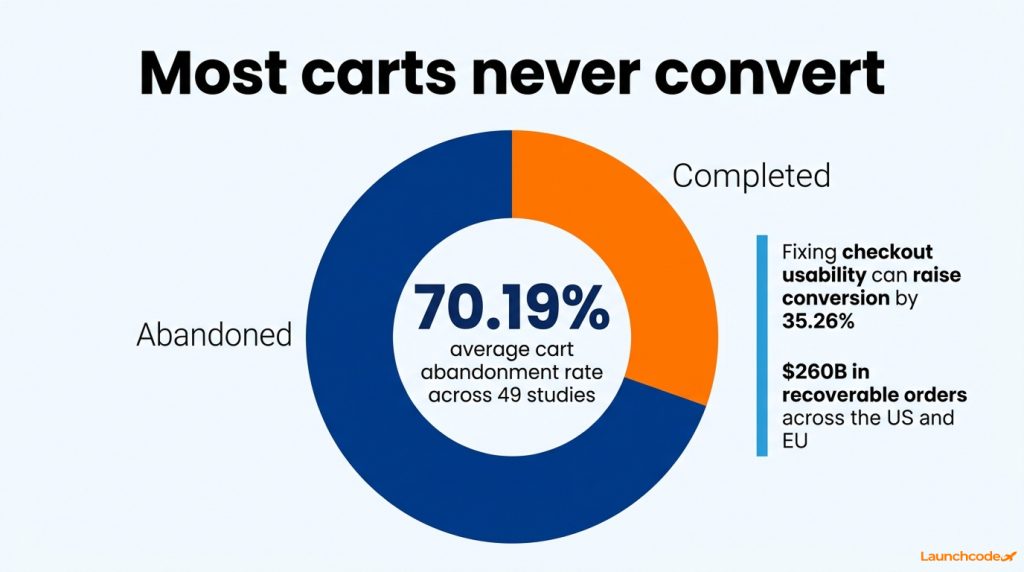
The checkout and the form are where intent turns into revenue or gets lost. Fixing documented checkout usability issues can raise conversion by an average of 35.26% for large ecommerce sites, equal to roughly 260 billion dollars in recoverable orders across the US and EU, according to Baymard Institute. This is the highest certainty design fix available.
Abandonment is not a demand problem. It is a friction and trust problem you can design away. Treating it that way changes where you spend effort.
The average documented cart abandonment rate is 70.19% across 49 studies, with mobile running higher than desktop. Roughly 7 of every 10 shoppers who add an item leave without buying. Rashel Hariri, CMO at Foursixty, describes cart abandonment as unresolved hesitation rather than a lack of intent.
Nearly 1 in 5 shoppers abandoned a cart because the checkout felt too long or complicated. Baymard’s research shows most checkouts can cut form elements by 20 to 60% without losing anything they need.
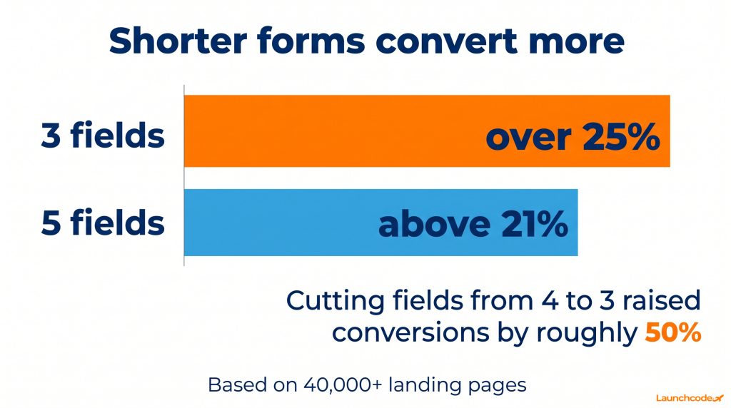
Form length is one of the highest impact, lowest risk levers in conversion design. A HubSpot analysis of more than 40,000 landing pages found that forms with 3 fields converted highest at over 25%, with 5 field forms above 21%. Reported testing shows that cutting fields from 4 to 3 raised conversions by roughly 50%.
Apply this without losing the data you need:
Trust signals reduce perceived risk at the exact moment a user decides. Place your strongest signals next to the call to action and form fields where commitment happens. Adding security badges and certifications increased conversion rates by about 15% in CXL testing, a measurable lift rather than a vague promise.
Trust is not decoration. It answers the silent question every buyer asks before they commit, which is whether this is safe and legitimate.
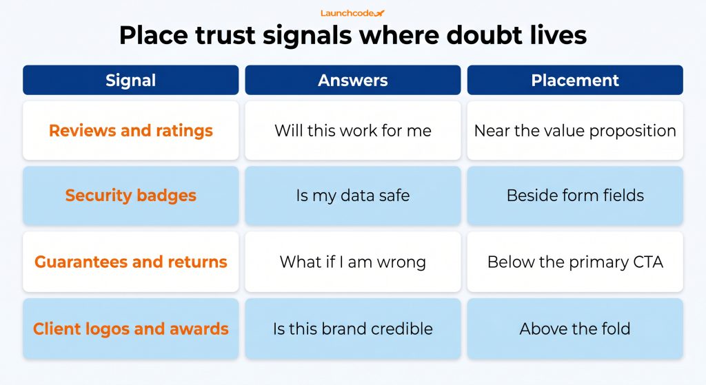
Different signals answer different doubts. Map them to the objection they resolve.
| Signal type | Objection it answers | Best placement |
|---|---|---|
| Reviews and ratings | Will this actually work for me | Near the product or value proposition |
| Security badges | Is my data and payment safe | Beside form fields and submit buttons |
| Guarantees and returns | What if I am wrong about this | Directly below the primary call to action |
| Client logos and awards | Is this brand credible | Above the fold for first credibility |
Vendor-reported lifts can be dramatic, but treat them as single-site evidence, not averages you should expect to repeat. A reported Shopify test moved a guarantee badge below the buy button and lifted conversion, yet the same badge underperformed on mobile and was kept on desktop only. Placement near the decision point matters, and you should test it on your own audience.
Rank design fixes by expected revenue, model the lift in dollars, then ship the highest return change first. This beats redesigning everything at once. Start with the fix that combines high certainty and high impact, usually speed or checkout, then work down the list while measuring revenue per visitor.
A prioritized method separates a redesign that pays off from one that burns budget. At Launchcodex, we sequence conversion work by expected revenue impact rather than by what is easiest to build, so the changes that recover the most money ship first.
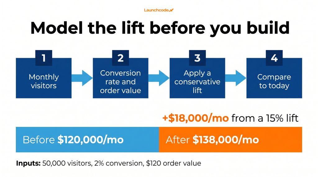
You do not need a complex model to make the case to finance. You need four inputs.
For example, a page with 50,000 monthly visitors, a 2% conversion rate, and a 120 dollar order value produces 120,000 dollars a month. A conservative 15% conversion lift from a checkout fix moves that to 138,000 dollars, an extra 18,000 dollars a month before you spend a dollar on more traffic.
| Fix | Expected impact | Certainty | Effort |
|---|---|---|---|
| Page speed on key pages | High | High | Medium |
| Checkout and form reduction | High | High | Medium |
| Trust signal placement | Medium | Medium | Low |
| Hierarchy and cognitive load | Medium | Medium | Medium |
| Personalization with AI | Variable | Medium | High |
A model justifies the work. A test proves the result. Run changes through an A/B testing platform like Optimizely or VWO, so you attribute the lift to the change, not to seasonality. Use Google Analytics 4 to track funnel drop off and revenue events, and tools like Hotjar to see where users hesitate before you form a hypothesis.
“The revenue model gets you the budget. The test gets you the truth. We model the expected lift in dollars to greenlight a project, then run it in VWO against a control so the result holds up when finance asks how we know it worked.” Derick Do, Co-Founder and Chief Product Officer
Reducing cognitive load lifts conversion because every extra choice or field adds a moment of doubt. Clear hierarchy and fewer decisions move users through faster. AI now extends this by personalizing experiences in real time and recovering carts before they are abandoned, an angle most competitors still treat as an afterthought.
Simplicity is harder than it looks, and AI is changing what is possible. Both deserve real attention in a modern conversion strategy.
Jakob Nielsen of the Nielsen Norman Group noted that it is easy to build a bulky design by adding layer upon layer, and far harder to create simple, graceful ones. His 10 usability heuristics remain the standard reference, and the core idea is that findability drives sales. If a customer cannot find a product, they will not buy it.
Apply this by leading each page with one clear action, using progressive disclosure to reveal detail in steps, and cutting any element that does not help the user decide.
AI adds value when it reduces effort or recovers lost intent, not when it adds novelty:
The pitfall is using AI to add motion and complexity that raise cognitive load. Hold every AI feature to the same test as any design change, which is whether it moves revenue per visitor.
Great design earns revenue when you treat it as a prioritized, measurable investment. Speed and checkout deliver the highest certainty returns, trust signals and hierarchy add steady gains, and AI extends the work when it reduces effort rather than adding it. The common thread is method. Rank fixes by expected revenue, model the lift in dollars, ship the highest return change, and measure with revenue per visitor.
Your next step is small and concrete. Pick one high-traffic page, run it through PageSpeed Insights and a quick form audit, and build the simple revenue model for the single fix with the highest expected return. For ecommerce teams and B2B SaaS companies alike, that one exercise turns design from a cost center into a growth lever you can defend with numbers.
A note on the data here. Lift ranges vary by baseline and industry, and vendor-reported case studies reflect single sites rather than averages. Use the sourced figures as direction, then confirm with your own tests. Last updated June 2026.
Both, and the revenue effect is measurable. McKinsey found top quartile design companies grew revenue 32 percentage points faster than peers over five years. On a single page, faster load times and shorter forms lift conversion and revenue per visitor.
Start with page speed or checkout, since both combine high impact with high certainty. A 0.1 second speed gain was linked to an 8.4% retail conversion lift, and fixing checkout usability can raise conversion by an average of 35.26%.
Fewer than most teams expect. HubSpot found 3 field forms converted highest at over 25%. Ask only for what you need now, use autofill and address lookup, and collect extra detail later through progressive profiling.
Mobile carries more friction. Pages load slower, forms are harder to complete, and 53% of mobile users abandon a page that takes longer than three seconds. Fewer than half of mobile sites pass all three Core Web Vitals, so speed is usually the first fix.
Run the change as an A/B test using a platform like Optimizely or VWO, and track revenue events in Google Analytics 4. Testing isolates t


Real stories from the people we’ve partnered with to modernize and grow their marketing.